Intersections
Carnegie Mellon Survey of Design Fall 2020: Communicative Shapes
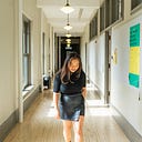
First Visit
I remember reading once about a NYC cab driver’s favorite two rides:
The first is when he gets to pick up a man who had just left a hospital after his child was born. Second, is when he picks up a young person from the airport moving to NYC full of dreams and aspirations. It’s an ethereal and breathtaking moment — going deeper and deeper into Manhattan, pressing their palms and flushed cheeks against the passenger side window, and immersing in the overwhelming energy of a community of infinite like-minded yet idiosyncratic individuals for the first time ever.
How do we find the perfect intersection?
I knew I would have arrived when I felt it. I walked direction-less out of CMU only knowing to head down Forbes and in the general direction toward the Cathedral of Learning. I wanted to trace my steps to find the exact spot (and in turn the exact moment) where (and in turn, when) it had first hit me that this new city I had never stepped foot in would be my new home, or at least the foundation of my journey to find all my future homes. Pittsburgh was a city I had never stepped foot in before I packed my life into two 50 pound luggages and my high school senior year backpack. My flight departed at 6am from San Jose, California, and running late that morning, I never even looked back to wave goodbye to my parents. Time difference accounted for, 12 hours accompanied by a few drifts in and out of sleep and the completion of half of Catcher in the Rye later, I was suddenly in the city I would enter adulthood in.
We talked about the weather. My Uber driver told me all about the days that would start with snow and end in a comfortable 70 degrees F. We wove through forest that reminded me of Santa Cruz and past bridges that reminded me of those connecting the east and west sides of the Bay Area. Eventually, we merged onto Forbes street, a street my driver assured me I would become really familiarized with.

The few weeks prior to coming to college, my mind had begun to spin its own tales and details that discredited CMU and the city of Pittsburgh. I didn’t believe that there were cities out there even comparable to New York or San Francisco. And I didn’t believe that I could find home in a place where I had no family. Yet, as we drove down Forbes street, my eyes couldn’t help but trace up the tall compacted buildings or to individualize the crowds moving across the sidewalks. Being able to draw similarities between the fundamental elements constituting physical spaces that I was familiar with to this entirely unfamiliar environment truly felt like waking up from a fever dream.
I chose to study the intersection at Forbes and Oakland Avenue because it almost acted like the threshold I crossed where it finally occurred to me where I now was, and that it was a very very real place to be. It was my coming of age movie worthy moment of pressing my palms against the glass of the passenger seat window, staring outward and upward and absorbing all the bustling energy and detail. I felt vertigo from just looking up at the Cathedral of Learning.

Looking around at all the pedestrians on the street, people in their cars, and windows in tall and vast building structures, I saw just how many other individual lives coexisted in this space with me. It was truly humbling, making me feel small, but definitely not unimportant.
I have always loved being in large cities because it allowed me to feel comfortable in my loneliness. However, when I stopped and stood in the middle of the crosswalk to take a few of these photos, I start to feel insecure. It is basically unspoken law to stop walking in the middle of a busy street. Pedestrians weren’t walking just to walk, but to get somewhere. I think I resonate with city life because of the general consensus of which laws of Social Order to follow, and which to dismiss. Strangers would walk into the middle of traffic to help an illegally parked car back out and get going, and pedestrians crossed streets whenever as long as there was no incoming traffic. I resonated with this ordered disorder and selective lack of care.


Each direction the intersection went into also told its own story. What is at the end of these four directions is necessary to define the intersection. The Northeast side headed toward University of Pittsburgh and CMU, while there can be forestry headed at the far end of the Southwest side. As shown in the Northwest and Southeast side, sections of Oakland Avenue were actually closed down to allow for outdoor dining.


The intention of the closed road was the complement the bustling social scene, which juxtaposed the natural urban energy of the street. It felt like stepping between two different worlds, where one was full of vehicle and foot traffic, and the other had perfectly organized and spaced out desks and chairs. One promoted movement while the other promoted the lack of it. It also felt almost wrong for me to cross into the closed road dining area as someone who was not dining; therefore, this otherwise safe-seeming space can actually come off as exclusive. While the vastness and liveliness of a city like Pittsburgh feels welcoming to all, this closed road literally, but also subjectively, set up divisions. Despite being meant to allow more people to be brought together, this invisible wall felt more like it set up divides.
Much of the language and signage itself also set up these different types of boundaries.

Everything was worded as an absolute, and often only what not to do: “DO NOT ENTER”, “ROAD CLOSED”, “NO LEFT TURNS”, “NO PARKING”, “NO TURN ON RED”, or “ONE WAY”.
So, that leads to the ultimate question: what even makes an intersection?
My initial reaction to the assignment was to be able to convey this physical intersection in a way that related it to the figurative definition of the word “intersection”. Simply said, an intersection is a clash of elements. It’s a threshold that’s crossed; its literal lines painted on asphalt marking disruptions in traffic. And these clashes of elements reveal the complements as well. The streets with the busiest vehicle traffic are also the streets with the most foot traffic. The more signage there is warning to “STOP”, the more movement the street actually has. An intersection is recognizable by the people, the traffic, the signage, or the types of architecture on its corners; however, the intersection itself is merely the lines we paint on the ground that we allow to separate and organize our environments, but also tie them together.


Second Visit
How did your understanding of your intersection change/evolve?
This second time I visited my intersection, I was more goal (or aspiration) driven and oriented. I wanted to be able to fit in as much detail and information into my photos as possible.
It was also important to try to maintain a balance between displaying features of the intersection, and the feelings of those features – the feeling of actually being at the intersection. Therefore, I tried to capture the details which emphasized the feelings of the intersection.
Here are some key features of the space I have concluded:
- One street of the intersection is closed off from traffic in order to allow for outdoor dining.
- There is a different view at the end of every side of the intersection
- I would say this intersection is one of the busiest parts of Forbes. As you continue walking down Forbes, past Oakland Ave, it gets noticeably gradually quieter and more still. It also feels and looks less city-like. There’s more natural green spaces and less urban looking architecture. There is less of both car and foot traffic. I think the reason for this is because this intersection is the place of destination for many.
- The fact that it is an intersection.
To get a better understanding of the intersection, I made a quick sketch from the roof of one of the restaurants. I especially wanted to focus on the intersection itself: the pedestrians crossing the street, the cars stopped at the red light, the cars parked, the cars as they turned left, the yellow curbs, the stoplights and signs, the thin chain fence blocking off the street for outdoor dining. Even the trash cans somewhat signified the start of an intersection, or acted as a blockade in the intersection.


I concluded there were two things I wanted my photos to stay true to:
- I wanted to retain that feeling of vertigo you get when you’re at this intersection. That was the reason I chose this intersection, and I wanted to stay honest to that. That was this intersection’s purpose.
- The cues that it was an intersection. The markings on the ground, the cars stopped at the markings, the people walking along them, the clutter of trashcans, mailboxes, and signage at the corners.
And there are tangible ways I can portray these features in my photos:
- Scale: capture the height of the buildings.
- Perspective: your eyes look from the middle of the photo (Cathedral of Learning) and trace outward, similar to the experience of craning your neck back to see the tall buildings closest to you.
- Depth: the feeling that the intersection never ends makes it feel vast.
- Inclusion and omission of specific details: the specific cues


White Relief
To start my relief and compositions, I had to decide on a single photo.
I did wonder though, if we are trying to represent the intersection most honestly by exactly replicating a photo — a single second in time––wouldn’t it be more honest to stitch together several photos, as in, several seconds in time?

This was the photo I decided on. It was the one that fit most of the criteria I set, and also conveyed a great amount of detail.
I edited it so the buildings were more straight-aligned. I also began to work with my photo in black and white so I could focus on how elements merged with (or distanced from) each other based on form, rather than color. For example, the signs and the pole could be cut out as one shape. The eye would still view it as signs on poles, and not a pole shaped with staggering rectangular shapes. These details could be omitted because the human eye would assume they were already there.

I traced the image on tracing paper first which helped me break down the basic shapes of the intersection. And then it just became a manner of layering. To convey perspective through the craftsmanship, I made it so that the buildings closest to us in the photo were also the highest level of the relief.


There were also a few techniques I experimented with. In order to make the patch of greenery at the very end of the view, I tried peeling away at the paper to create texture. I also considered rendering the clouds in the sky through crumpling and flattening out ripped pieces of paper. These clouds helped add a sense of dimension to the background, while also defining it as a sky.
Grayscale Composition
I chose to use the different tones of grey to show depth and perspective of my intersection. I also borrowed techniques from the white relief, where I also layered same tones of grey atop each other to further show depth. The goal was that as the composition moved outward, it would blend into darker tones of grey.


I drew a few sketches and then brought the photo into Procreate where I traced shapes of buildings to be similar to the shapes I would be cutting out. I also labeled the colors to organize the composition.
Of the final rendition of my first grayscale attempt:
Things that worked:
- The relief technique in addition to the use of grey tones to convey depth.
- The use of black to bring specific elements to the front. Specifically, how the black compares/works against the grey. One example is how the poll closer to the front is in black, while the poll one block behind is in a dark shade of grey. This allows the two–and everything else on their planes–to be compared.
Areas for reconsideration and improvement:
- I placed parts of the composition wrong. In my composition, the crosswalk where the car is stopped is placed too low. This made it so that the car I cut out to include did not fit in the spot where it was supposed to. Having the same car, but placed lower on the composition, looked logically wrong because as it was lower on the page it was also closer to the viewer and therefore should have been larger.
- The shades of grey are somewhat inconsistent. They range from warm to neutral to cool toned. The darkest grey is also noticeably significantly lighter than the black. These differences in warmth and tonal range made it difficult to achieve the gradient effect I envisioned.
- The Cathedral of Learning is white, and the only subject that is white. I think this works because it emphasizes the Cathedral to be the center of the perspective. However, considering the craftsmanship, if the white were swapped with the lightest shade of grey, there could be more tones of grey used throughout the buildings, which could help achieve more of the depth I want.
Color Composition
Color could serve many different purposes: it could attract attention, act as another tone, or bring aesthetic pleasure. I wanted to use color to add to the narrative of my composition. Narratives are important to me. They allow me to tell my own version of a story, and open the floor to viewers to ask more questions and make their own stories. Narratives make life and art more enjoyable.
I chose to include the color red because it symbolized stopping. Remembering my first visit to the intersection, there was definitely a unique quantity of signage calling to “STOP”. For an intersection that was so busy, I wanted to play with the idea of emphasizing stopping.
That’s also what my photo and composition and interpretation of this assignment was all about. It is an attempt to capture a single paused moment in time.

I borrowed many of the same components from my greyscale, but made sure the buildings lined up on the page correctly and properly fit the car in.
Refinement and Conclusions
The criticism I needed to work on most was to add more action and liveliness to my compositions.
The scene I’m working with could be split into two distinct worlds. On a macro level was the vastness and scale, conveyed by the tall buildings. On a micro level was all the activity happening at the ground level – the pedestrians, the density of small shops and restaurants, all of the little lights and windows. Both elements made the scene overwhelming, a key characteristic my composition was lacking.


I went back to take some more notes on my photo. I specifically wanted to focus on what new details to add, and which were not as necessary.
I also started to reference the original color photo again. This brought out details that seemed washed out in the black and white edit. For one, I noticed that there were actually two blocks shown in my photo. I also noticed the bridge at the end of the intersection, and decided that might have been a more telling detail to include than the patch of greenery.

Some changes I made
White Relief:
- I actually didn’t remake this one. It felt authentic. And the differences in the white one helped inform the greyscale and color compositions. This version of the white relief added to the experience of seeing all three reliefs together.
Greyscale:
- Both the background and the Cathedral are white.
- There is more black incorporated into the composition. It created more depth and also made more details stand out.
- I included more details overall, especially at the ground level. I added some more windows, signage, storefronts, and pedestrians.
- The Litchfield Towers are differing shades of grey. This helped add more depth because one felt closer than the other.
Color:
- More elements were made red. The entire pole and signs and the entire car were made red because the details of the logo or break lights specifically were not exactly necessary to express my point. Making these entire subjects red were also more visually pleasing.
- I took out less detail in the Litchfield Towers in the background. Subjects closer to the observer should be more in detail than those in the background. The detail in the Litchfield Towers detracted from the amount of detail I wanted to show in the stores in the stores in front. I also felt like if I wasn’t going to actually carve out every detail in the subjects near the front, I could still compromise by leaving out detail near the back. It also felt like even though the color were identical in shape and form to the ones in the grayscale renditions, they somehow added a sense of more detail. In the color composition, the details in the Litchfield Towers could have felt like overworking the piece.
- Takeaway: verbal versus visual versus intellectual reasonings. I felt that my use of color in the first color composition was more out of more verbal reasoning than a visual one. It sounded better in my mind than it actually turned out on the composition. Through using color in larger blocks, though, I think I was able to find a balance between verbal and visual reasonings.


Final Reflection
To finally answer the guiding question of this project “Can a reduction to simple shapes still be descriptive?” My answer is that it can still be descriptive, but of more of the homogenized scene than of a moment or feeling.
This was in part because I chose an intersection — in which the beauty of it was its complexity — to simplify. In one of the initial discussions, the question was posed: What makes an intersection “feel” safe? Our “feelings” of different environments come from split-second decisions. Our feelings are really only memories, and then memories of memories, and memories are incredibly inaccurate and unrealistic. Someone standing at the intersection between Forbes and Oakland Avenue is not going to remember it by the exact contours or numbers of buildings on either side of the street. For example, in a memory, the Cathedral probably towers over all the other buildings, which wouldn’t make sense perspective-wise in a 2D rendering.
Point of View also played a big part. My photos and compositions didn’t make my intersection jarringly recognizable because I don’t think many people viewed my intersection from my POV, someone stopped in the middle of the street. Everything and everyone moves really fast, and the world is viewed differently when you’re the one moving. My composition attempted to document everything around me moving.
In conclusion, I learned a lot about my intersection through the components I could portray through my compositions, and also through the components I found difficult to. The process of crafting these compositions did reveal details of the intersection that would be missed “on the everyday” but also posed a new question: Does descriptiveness always help make an environment more identifiable?